Communicating Results
Learning Objectives
In this chapter you will learn:
- how to communicate results for quantitative studies
- how to communicate results for qualitative studies.
5.6 Quantitative Studies: Communicating Results
In the results section of a report (or article), the findings of the study are reported with connection(s) to the study’s research question(s). Here, the author(s) present findings in the form of tables and/or figures presented in a logical sequence. The written sections accompanying each table/figure need to link back to the research question(s), but only state the facts of what the table/figure presents. The results section should inform the reader what the author(s) found (do not interpret, be careful of introducing bias), and the discussion section is where the author(s) explain/discuss what the findings mean.
The opening paragraph(s) of the results section should start with an introduction. The results need to be connected to the research question(s). This reorients the reader back to the study’s purpose. Next, present your results in a logical manner. This is where you present your tables and/or figures with a written description that highlights the most important/interesting piece of information in the table/figure. To end the results section, provide a paragraph that highlights and summarises the key information you have presented, with a concluding sentence linking the results section to the discussion section of the report (article).
Tables and figures must be numbered in the order they appear in the report, along with an appropriate name that represents what is shown in the table/figure. Do not mix the table and figure numbering; they are numbered separately, for example, Table 1, Table 2, Table 3, Figure 1, Figure 2, Figure 3. When writing about what a table/figure shows, only refer to them as, for example, Table 1 or Figure 1, do not include the name of the table/figure.
Remember:
- Pay attention to your sentence construction, paragraph construction, punctuation, spelling (Australian English), and grammar.
- Be careful not to introduce bias into your writing. You can only state what you have found; you cannot make assumptions.
- Ensure you provide (written) linkages back to the research question(s).
- Ensure you label and name your tables/figures correctly.
- Save the interpretation for the discussion section.
Selecting the Graph (Figure) or Table
There are a variety of figures and tables that can be used to present the results of a study. The following section provides examples for presenting results from nominal, ordinal, continuous, and discrete data.
Frequency Table
- Used for one variable
- Suitable for nominal, ordinal, continuous or discrete data.
See tables 5.3 and 5.4 for different ways to display information in a frequency table.
Table 5.3. Number of pets owned (n=40)
| Pet | Frequency | Percentage |
| Dog | 21 | 52.5% |
| Cat | 15 | 37.5% |
| Fish | 3 | 7.5% |
| Bird | 1 | 2.5% |
| None | 0 | 0.0% |
Table 5.4. Pets by percentage
| Pet | Percentage |
| Dog | 52.5% |
| Cat | 37.5% |
| fish | 7.5% |
| Bird | 2.5% |
| None | 0.0% |
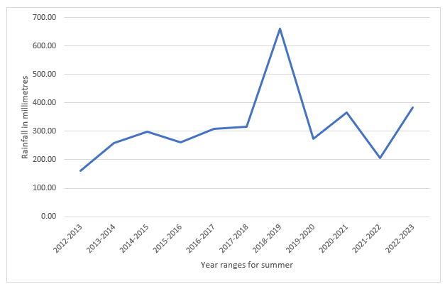
Trend Line
- used for one variable
- suitable for nominal, ordinal, continuous, or discrete data.
You want to know the trend in average summer rainfall over 10 years for Cairns in Far North Queensland. The best way to display this is a trend line (Figure 5.7).
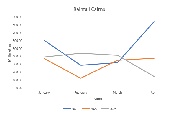
Multiple Line Figure
- suitable for two or more variables
- suitable for ordinal, continuous, or discrete data.
- does not indicate a trend, it compares multiple data sets over time or across categories.
This time, we look at total rainfall for Cairns during January, February, March, and April in the years 2021, 2022, and 2023 (Figure 5.8).
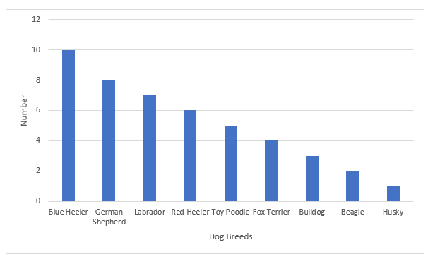
Bar Figure
- use for one variable
- suitable for nominal, ordinal, or discrete data (Figure 5.9).
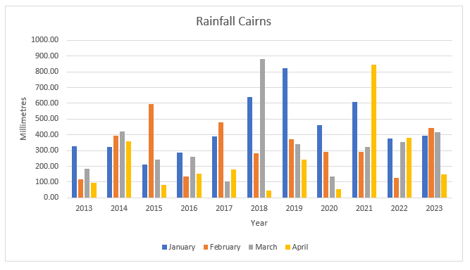
Multi-Bar Figure
- Use for two or more variables.
- Suitable for nominal, ordinal, continuous, or discrete data.
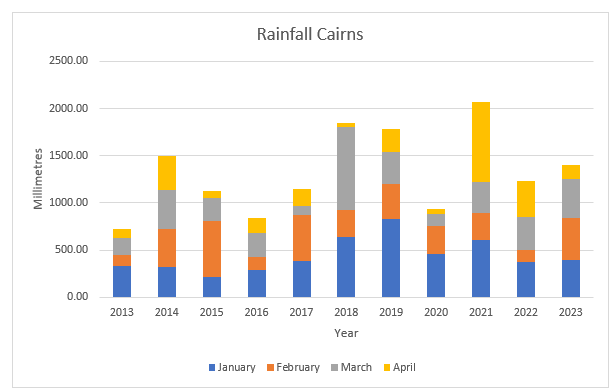
Rainfall data are displayed for January, February, March, and April in Cairns from 2013 to 2023 (Figure 5.10).
Stacked Bar Figure
- use for two or more variables
- suitable for nominal, ordinal, continuous, or discrete data.
We are using the same data as used for Figure 5.10, however, this time the data are displayed as a stacked bar figure (Figure 5.11).
Pie Figure (= Pie Chart)
- use for one variable
- suitable for nominal, ordinal, continuous, or discrete data.
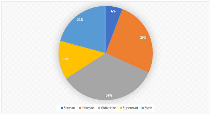
You are interested in knowing who your cohort of students believes would win a battle between superheroes. The superheroes are Batman, Ironman, Wolverine, Superman, and the Flash. Results are in Figure 5.12. Remember, when you use a pie figure, the total percentages must add to 100%.
Comparative Pie Figures
- Use for two or more variables.
- Suitable for nominal, ordinal, continuous, or discrete data.
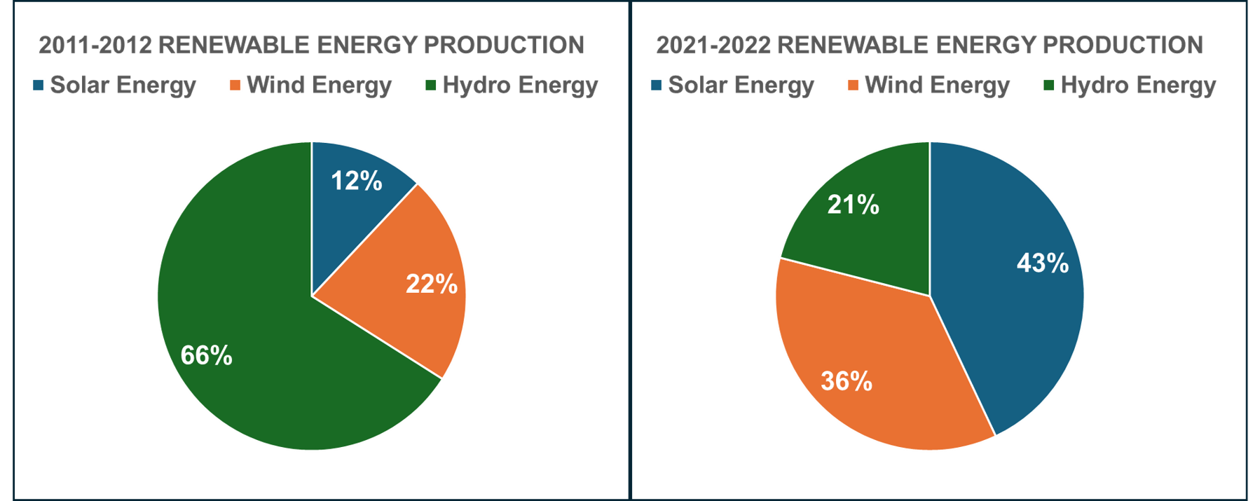
Comparative pie figures (AKA, pie charts) are used to compare the same things at different points in time. Figure 5.13 shows the difference in renewable energy production for 2011-2012 and 2021-2022.
Cross-Tablulation
- use for two or more variables
- suitable for nominal, ordinal, continuous, or discrete data.
What you see below is the output of a cross-tabulation; this is not how you would display the results, for that, you could write the information. For example, the majority of respondents live in Bendigo (38.56%), with 42.37% saying Essendon is their favourite AFL team. Over half (52.27%) of respondents whose favourite team is Collingwood live in Collingwood, and 44% of respondents whose favourite team is the Brisbane Lions live in Fitzroy (Table 5.5).
Table 5.5. Cross-tabulation output
| Cross tabulation frequency percent | What is your favourite AFL team? | ||||
| Collingwood | Brisbane Lions | Essendon | Row totals | ||
| In what city/town do you live? | Collingwood | 23 | 14 | 7 | 44 |
| Row percent | 52.27% | 31.82% | 15.91% | 28.76% | |
| Fitzroy | 13 | 22 | 15 | 50 | |
| Row percent | 26.00% | 44.00% | 30.00% | 32.68% | |
| Bendigo | 15 | 19 | 25 | 59 | |
| Row percent | 24.42% | 32.20% | 42.37% | 38.56% | |
| Column totals | 51 | 55 | 47 | 153 | |
| Column percent | 33.33% | 35.95% | 30.72% | 100.00% | |
Contingency Table
- use for two or more variables
- suitable for nominal, ordinal, continuous, or discrete data.
The following (Table 5.6) is an example of the output for a contingency table. To report results, you would write them up. For example: You want to know if there is a relationship between milkshake preference and gender. You run the data, and the contingency results answer the question. Due to the way the question is written you must look at the row results. You find males prefer chocolate (31.25%), females also prefer chocolate (36.14%), and those who do not identify as male, or female prefer the blue heaven milkshake (34.67%).
Table 5.6. Contingency table output
| Gender | Chocolate | Caramel | Blue Heaven | Vanilla | Total |
| Male | 25 | 22 | 18 | 15 | 80 |
| Row percentage | 31.25% | 27.50% | 22.50% | 18.75% | 100% |
| Column percentage | 34.72% | 35.48% | 26.47% | 41.67% | 100% |
| Female | 30 | 19 | 24 | 10 | 83 |
| Row percentage | 36.14% | 22.89% | 28.92% | 12.05% | 100% |
| Column percentage | 41.67% | 30.65% | 35.29% | 27.78% | |
| Other | 17 | 21 | 26 | 11 | 75 |
| Row percentage | 22.67% | 28.00% | 34.67% | 14.67% | 100% |
| Column percentages | 23.61% | 33.87% | 38.24% | 30.56% | |
| Total | 72 | 62 | 68 | 36 | 238 |
| 100% | 100% | 100% | 100% |
Scatter Figure (AKA scatter graph)
- used for two variables
- suitable for ordinal, continuous, or discrete data.
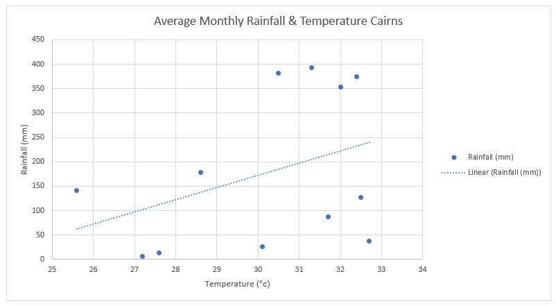
Figure 5.14 shows the annual monthly rainfall and temperature for Cairns on a scatter plot (AKA scatter graph).
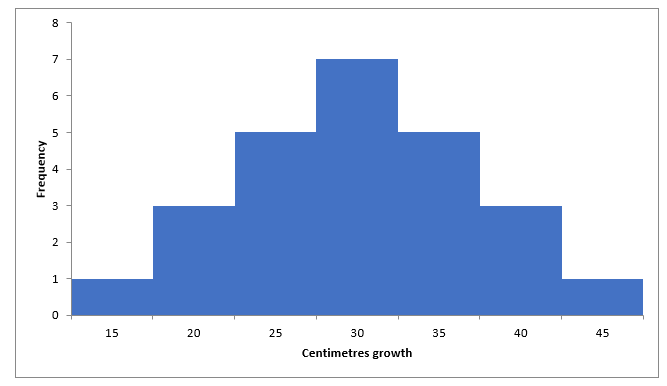
Histogram
- use for one variable
- suitable for continuous or discrete data.
This time, we are looking at the growth rate of plants over one month to see if the data are normally distributed (Figure 5.15).
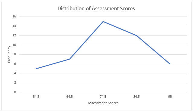
Frequency Polygon (Figure)
- use for one variable
- suitable for continuous or discrete data.
The data are fictitious and relate to assessment scores (Figure 5.16).
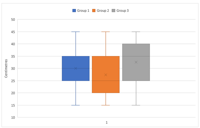
Multiple Box Plot (Figure)
- use for two or more variables
- suitable for continuous or discrete data.
The growth of three groups of plants over one month is shown in Figure 5.17.
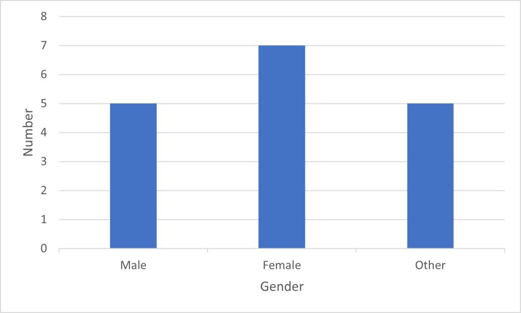
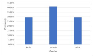
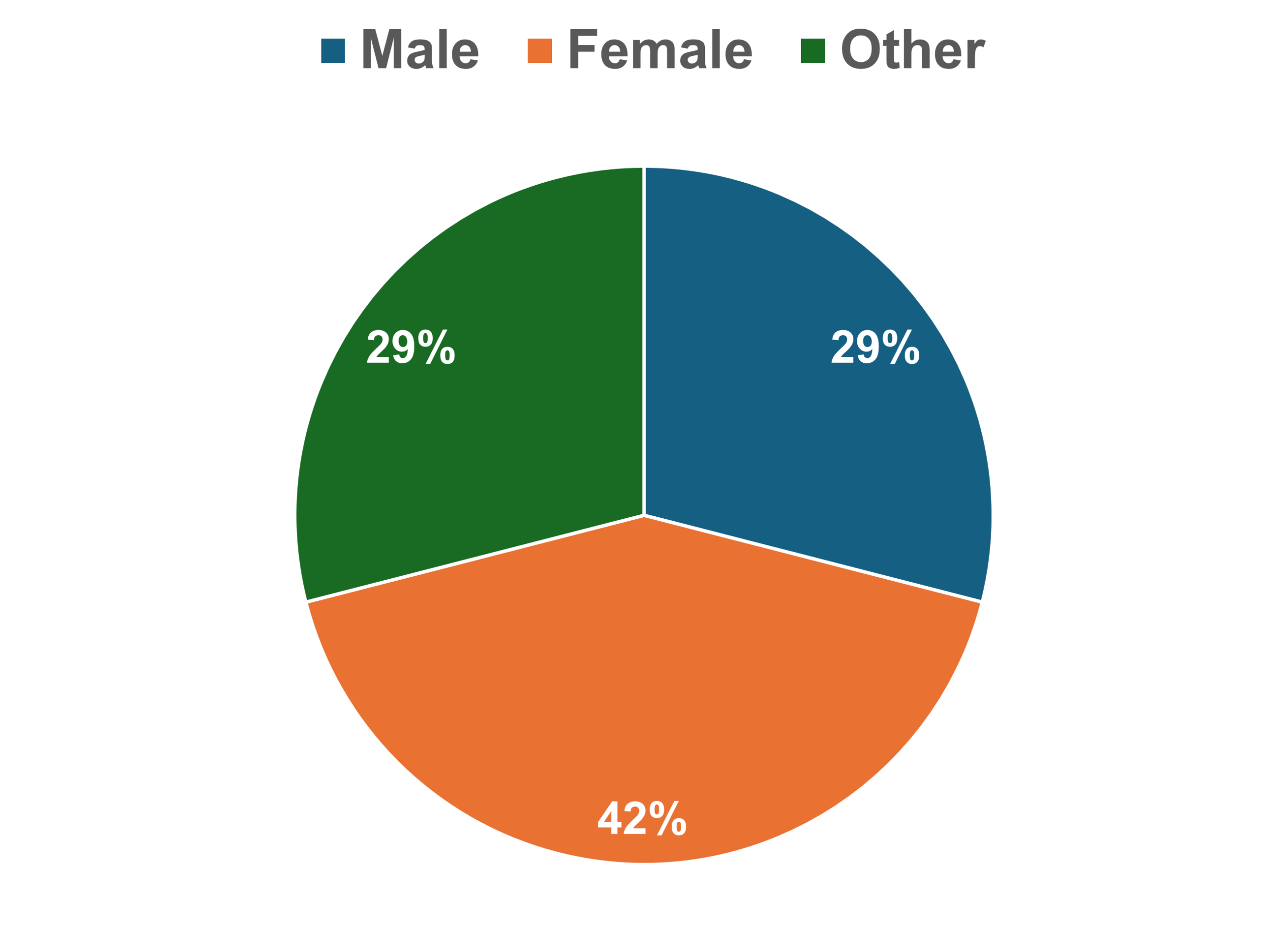
Examples of Tables and Graphs
(Figures 5.18, 5.19, and 5.20 use the same data, but results are displayed differently.)
An example of how to write a brief explanation that goes with the Figure/Table in the results section is included. This would be further elaborated on in the discussion section.
The majority of respondents in this study are female (Figure 5.18).
As seen in Figure 5.19, the majority of respondents in this study identify as female (41.18%).
As seen in Figure 5.20, the majority of respondents in this study identify as female (41.18%).
Gender results can also be reported as part of a table that relates to respondent demographics. The majority of male respondents (80%), in this study are in the 18 to 30 age group (Table 5.7). Female respondents were split evenly between the 18 to 30, 41 to 50, and 51 to 60 years age groups (28.57% each); with 40% of those who did not identify as male or female falling into the 18 to 30 age group, with another 40% falling within the 51 to 60 age group (Table 5.7).
Table 5.7. Demographics of respondents (n=17)
| Variable | % Male (n=5) | %Female (n=7) | % Other (n=5) | |
| Gender | 29.41 | 41.18 | 29.41 | |
| Age group | 18-30 | 80.00 | 28.57 | 40.00 |
| 31-40 | 0.00 | 14.28 | 0.00 | |
| 41-50 | 20.00 | 28.57 | 20.00 | |
| 51-60 | 0.00 | 28.57 | 40.00 |
5.7 Qualitative Studies – Communicating Results
Communicating results for qualitative studies is the writing up and publishing of research based on qualitative data is as per that of quantitative or mixed methods data in that it requires that consideration be given to the intent of the research and the audience for which it is intended, e.g., for an academic journal or for funders reports, book chapters, thesis or for the wider public or policy and decision makers.
These days, there is a big focus on presenting the research for outreach and impact, i.e., making sure that the research is read and has applications that are beyond academia. Also, there is an expectation that the results will be shared with the participants. Hence, there are some points to consider when sharing and communicating qualitative research. Tracy (2020, p. 304) identifies these points as follows:
- What is the story about?
- What is the rationale behind the research?
- Who is the intended audience?
- What are the themes/topics?
- How am I connecting to a scholarly conversation?
- What are the conclusions, implications, limitations, and future research?
- Is the writing flowing in a logical manner and is it persuasive?
- Use prose and visual representations of the data and/or results.
Successfully presenting the results from qualitative studies can depend on such factors as the researcher’s discipline, the researcher’s goals, or the journal/tome to be published in. How the presentation of the results looks should take advantage of the deep, rich data obtained from qualitative studies (Tracy, 2020). For example, ethnographers may present narrative portraits of the communities that they have been studying (Rodriǵuez-Dorans, 2023). Other researchers may prefer to utilise tables and diagrams in the presentation of their qualitative findings (Kriukow, 2020). The following webinar provides some ‘Creative Ways to Visualise Qualitative Data’ [1:02:15].
See also How to Present Qualitative Findings from qualitative researcher, Dr Kriukow [21:30].
Key Takeaways
-
Quantitative, qualitative and mixed methods approaches to research allow for the sharing and communicating of the research findings in an array of ways.
- Not surprisingly, quantitative researchers tend to use more numerical tools for presenting their data, e.g., tables and graphs.
- Qualitative researchers, on the other hand, can extend the use of quantitative tools to adopt techniques that utilise prose and narrative more extensively.
References
Kriukow, J. (2020, July 18). How to present qualitative findings [Video]. YouTube. https://www.youtube.com/watch?v=SYA7w25VLMM
Rodríguez-Dorans, E. (2023). Narrative portraits in qualitative research. Routledge.
Thompson, W. E. & Thompson, M. L. (2023). Pulling back the curtain on qualitative research. Routledge.
Tracy, S. J. (2020). Qualitative research methods : Collecting evidence, crafting analysis, communicating impact (2nd ed.). Wiley-Blackwell.
