10.5. Presenting Your Results
By Rajiv S. Jhangiani, I-Chant A. Chiang, Carrie Cuttler and Dana C. Leighton, adapted by Marc Chao and Muhamad Alif Bin Ibrahim
After analysing your data using descriptive statistics, the next step is to communicate your findings clearly and effectively. This section will guide you on how to present your results in writing, figures, and tables, following the American Psychological Association (APA) guidelines. These guidelines ensure consistency and clarity, whether you are preparing a written research report, a poster, or a slideshow presentation.
Presenting Descriptive Statistics in Writing
When presenting descriptive statistics in APA style, clarity and consistency are essential.
First, when writing numbers in text, words should be used for numbers less than 10, provided they do not represent precise statistical values. For numbers 10 and above, as well as all statistical results, numerals should always be used. Statistical results must also be presented as numerals (e.g., 2.00 instead of two or 2), and they should typically be rounded to two decimal places, unless specified otherwise. Results can either be included directly in the narrative or placed in parentheses, similar to how reference citations are handled.
When reporting a small number of results, embedding them directly into the text is often the most effective approach. For example, the mean age of the participants was 22.43 years, with a standard deviation of 2.34. Another example might read: Participants with low self-esteem in a negative mood expressed stronger intentions to have unprotected sex (M = 4.05, SD = 2.32) compared to those in a positive mood (M = 2.15, SD = 2.27). Similarly, the treatment group had a mean score of 23.40 (SD = 9.33), while the control group had a mean score of 20.87 (SD = 8.45). Additionally, the test-retest correlation was 0.96, or There was a moderate negative correlation between the alphabetical position of participants’ last names and their response time (r = −0.27).
When results are integrated into the narrative, the terms mean and standard deviation should be written out in full. However, when they are included parenthetically, the symbols M and SD should be used instead. Maintaining consistency in style is particularly important when presenting comparable results. For example:
- ✅ The treatment group had a mean of 23.40 (SD = 9.33), while the control group had a mean of 20.87 (SD = 8.45).
- ❌ The treatment group had a mean of 23.40 (SD = 9.33), while 20.87 was the mean of the control group, which had a standard deviation of 8.45.
Presenting Descriptive Statistics in Figures
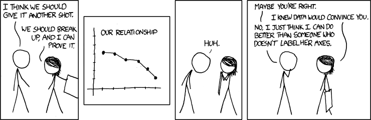
When reporting a large amount of data, figures, such as pie charts, bar graphs, and scatterplots, can often present information more clearly and efficiently than text alone (Figure 10.5.1) . In an APA-style research report, these graphical representations are referred to as figures.
When preparing figures, it is essential to follow some general principles to ensure clarity and accuracy. First, figures should add value to the presentation of results rather than simply repeat information already provided in text or tables. If a figure makes the data clearer or more efficient to understand, you might consider removing the corresponding text or table. Second, figures should be kept as simple as possible. While colour can be effective in posters, slideshow presentations, or textbooks, the APA Publication Manual recommends avoiding unnecessary use of colour in printed reports unless it adds essential clarity. Third, figures should be self-explanatory. Readers should be able to understand the main findings directly from the figure and its caption without having to refer to the main text.
In addition to these general principles, there are specific technical guidelines for creating figures according to APA style:
Graph Layout:
- Graphs, including scatterplots, bar graphs, and line graphs, should generally be slightly wider than they are tall for better readability.
- The independent variable should always be plotted on the x-axis, while the dependent variable goes on the y-axis.
- Values on the x-axis should increase from left to right, and values on the y-axis should increase from bottom to top.
- Both axes should ideally start at zero unless a different starting point is necessary for clarity.
Axis Labels and Legends:
- Axis labels should be clear, concise, and include units of measurement if these are not already specified in the caption.
- Axis labels should run parallel to their respective axes for clarity.
- Legends should appear within the figure and should be easy to interpret.
- The font style and size used in the figure should be consistent throughout, with a size no smaller than 8 points and no larger than 14 points.
Captions:
- Every figure caption should begin with the word “Figure”, followed by its number in the order it appears in the text, ending with a period. The title should be italicised.
- The caption should include a brief description of the figure, followed by a period (e.g., “Reaction times of the control versus experimental group.”).
- Any additional information necessary to interpret the figure, such as abbreviations, units of measurement (if not already specified on the axes), or units for error bars, should also be included after the description.
Bar Graphs
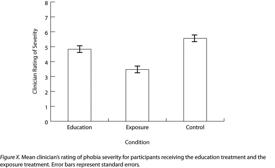
Bar graphs are commonly used to display and compare the average scores (means) of two or more groups or conditions. They are especially effective for visually highlighting differences between groups in a clear and straightforward way.
In an APA-style bar graph, like the one shown in Figure 10.5.2, each bar represents the mean score for a group or condition. These bars make it easy to compare groups at a glance. An additional important feature of bar graphs is the error bars, which are the small vertical lines extending upward and downward from the top of each bar.
Error bars indicate the variability of the data within each group. They typically represent the standard error of the mean rather than the standard deviation. The standard error is calculated by dividing the standard deviation of the group by the square root of the sample size. This measure is used because it provides an estimate of how much the group mean might vary from the true population mean.
Error bars are also helpful for assessing statistical significance. As a general rule, if the error bars of two groups do not overlap, it suggests that the difference between those groups is likely to be statistically significant. In other words, it is a visual cue that the observed difference is unlikely to have occurred by chance.
Line Graphs
Line graphs are ideal for displaying data when the independent variable is continuous, for example, when it represents time or another variable measured on a numeric scale. They are also useful for showing correlations between quantitative variables when the independent variable has only a small number of distinct levels.
In a line graph, each point represents the average (mean) score on the dependent variable for participants at a specific level of the independent variable. These points are then connected by a line to visually demonstrate trends or patterns in the data. In Figure 10.5.3, an APA-style example of a line graph, error bars are included to show the standard error of the mean for each data point, adhering to APA formatting guidelines.
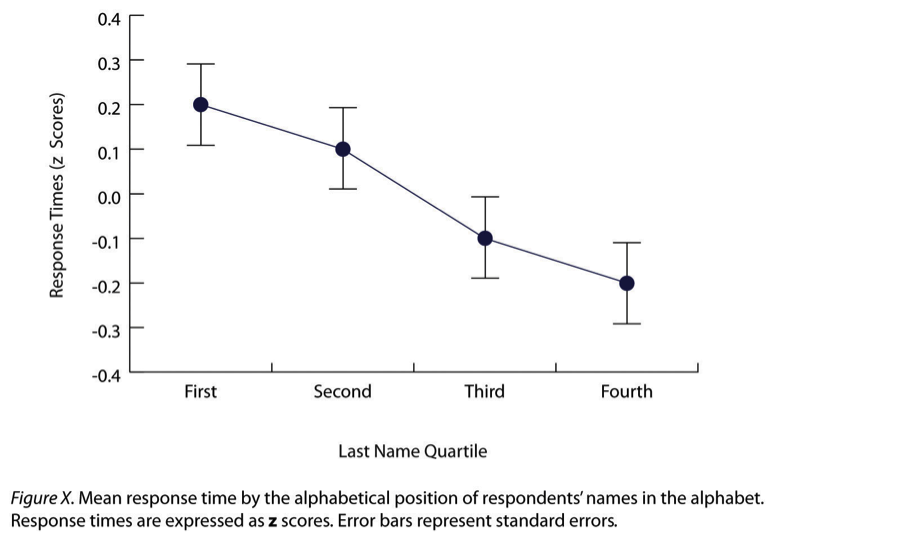
Interestingly, the data presented in a line graph could often be shown in a bar graph instead. For instance, in Figure 10.5.3, each point could be replaced with a bar reaching the same height, and the error bars would remain in place. This similarity highlights that both bar graphs and line graphs represent differences in average scores across levels of an independent variable.
However, there is a general convention in research for deciding which type of graph to use. Bar graphs are typically used when the x-axis represents categorical variables (e.g., treatment groups or conditions). In contrast, line graphs are preferred when the x-axis represents a quantitative variable (e.g., time intervals, dosage levels, or score ranges).
Scatterplots
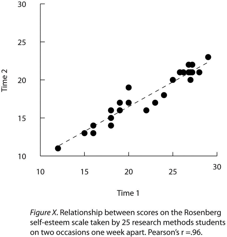
Scatterplots are an effective way to show correlations and relationships between two quantitative variables, especially when the variable on the x-axis has a wide range of values. Unlike bar or line graphs, each point in a scatterplot represents one individual data point rather than an average or group mean. The points are not connected by lines, which helps to highlight the overall pattern or trend in the data.
In Figure 10.5.4, an APA-style scatterplot example, several important features are demonstrated. First, when both variables on the x-axis and y-axis are conceptually similar and measured on the same scale, like repeated measurements of self-esteem on two different occasions, the axes can be made equal in length to visually emphasise their similarity.
Second, sometimes multiple data points might overlap because two or more individuals have identical scores on both variables. This overlap can be addressed in a few ways:
- Offsetting the points slightly along the x-axis so they appear side by side.
- Adding a number in parentheses next to the point to indicate how many individuals share that score.
- Adjusting the size or darkness of the point to reflect the number of overlapping data points.
Finally, a scatterplot often includes a regression line. This is a straight line that best represents the overall trend of the data points. The regression line helps to show whether the relationship between the two variables is positive, negative, or neutral, and how closely the points align with this trend.
Expressing Descriptive Statistics in Tables
Tables are a powerful tool for presenting large amounts of statistical data in a clear and organised way. Like graphs, they should serve a clear purpose, add valuable information, and be easy to understand on their own without requiring extensive reference to the text.
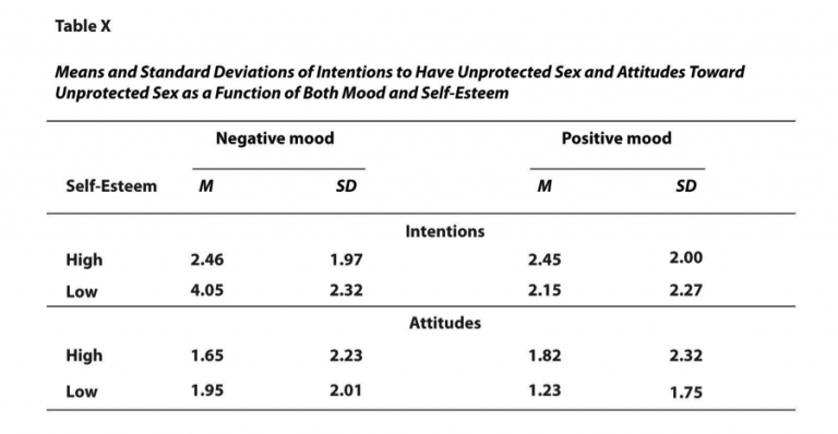
One of the most common uses of tables is to display multiple means and standard deviations from complex research designs involving several independent and dependent variables. For example, Figure 10.5.5 illustrates results from a hypothetical study similar to the one conducted by MacDonald and Martineau (2002). In their study, participants were categorised based on their self-esteem levels (high or low), placed in positive or negative moods, and then evaluated on their intentions toward unprotected sex as well as their attitudes toward unprotected sex.
The table in Figure 10.5.5 is structured clearly. Horizontal lines run across the top, bottom, and beneath column headings to improve readability. Each column is labelled appropriately, including the leftmost column, which provides context for the rows. Additionally, some column headings span multiple columns, allowing related data to be grouped together efficiently. APA-style tables are also numbered consecutively (e.g., Table 1, Table 2) and are accompanied by a concise yet descriptive title that summarises the table’s purpose.
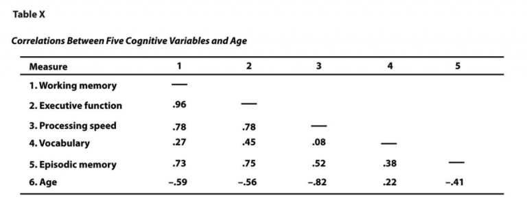
Another frequent use of tables is to present correlations among multiple variables, usually represented by Pearson’s r. This type of table is called a correlation matrix. Figure 10.5.6 shows a correlation matrix based on a study by McCabe et al. (2010). The researchers examined the relationships between working memory and several cognitive abilities, such as executive function, vocabulary, and age.
From the table, we can quickly identify patterns. For example, the correlation between working memory and executive function was extremely strong at 0.96, while the correlation between working memory and vocabulary was more moderate at 0.27. Additionally, it is clear that most measures, except vocabulary, tend to decline with age.
One important feature of correlation matrices is that only half the table is filled in because the other half would simply duplicate the same values. For example, the correlation between working memory and age in the upper right corner is identical to the one between age and working memory in the lower left corner. Similarly, a variable’s correlation with itself is always 1.00, which is typically replaced with dashes (—) to reduce clutter and improve readability.
When presenting data in tables, it is important to remember that specific numerical results do not need to be repeated in the text. Instead, the text should focus on highlighting major trends and drawing attention to key details or patterns that are especially significant or relevant to the research question.
References
MacDonald, T. K., & Martineau, A. M. (2002). Self-esteem, mood, and intentions to use condoms: When does low self-esteem lead to risky health behaviors? Journal of Experimental Social Psychology, 38(3), 299–306. https://doi.org/10.1006/jesp.2001.1505
McCabe, D. P., Roediger, H. L. III, McDaniel, M. A., Balota, D. A., & Hambrick, D. Z. (2010). The relationship between working memory capacity and executive functioning: Evidence for a common executive attention construct. Neuropsychology, 24(2), 222–243. https://doi.org/10.1037/a0017619
Chapter Attribution
Content adapted, with editorial changes, from:
Research methods in psychology, (4th ed.), (2019) by R. S. Jhangiani et al., Kwantlen Polytechnic University, is used under a CC BY-NC-SA licence.
