10.1. The Distribution of a Variable
By Rajiv S. Jhangiani, I-Chant A. Chiang, Carrie Cuttler and Dana C. Leighton, adapted by Marc Chao and Muhamad Alif Bin Ibrahim
A variable’s distribution shows how its values are spread out across different categories or levels. In simple terms, it tells us how often each value occurs in the data.
For example, imagine a survey of 100 university students measuring the variable “number of siblings”. The distribution might look like this:
- 10 students have no siblings
- 30 students have one sibling
- 40 students have two siblings
Similarly, for a variable like “sex,” the distribution might show:
- 44 students identify as male
- 56 students identify as female
A variable’s distribution gives us a clear picture of how its values are shared among participants, making it easier to understand and interpret the data.
Frequency Tables
A frequency table is a simple and clear way to show how data is distributed across different values of a variable. It organises data into two columns: one for the possible values of the variable and the other for how often each value appears in the dataset.
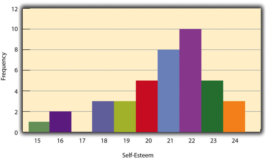
For example, consider Table 10.1.1, which displays scores from the Rosenberg Self-Esteem Scale for 40 college students. The first column lists the self-esteem scores, and the second column shows how many students received each score. For instance, three students scored 24, five scored 23, and so on. From this table, we can easily observe:
- The range of scores (from 15 to 24)
- The most common score (22) and the least common score (17)
- Any unusual or extreme values
| Self-Esteem Score | Frequency |
|---|---|
| 24 | 3 |
| 23 | 5 |
| 22 | 10 |
| 21 | 8 |
| 20 | 5 |
| 19 | 3 |
| 18 | 3 |
| 17 | 0 |
| 16 | 2 |
| 15 | 1 |
Key Features of Frequency Tables
Order of Values: The values in the first column are typically arranged from highest to lowest and only include scores that actually appear in the dataset. For example, although Rosenberg scores can range from 0 to 30, the table above only includes scores from 15 to 24 because that is where the data lies.
Grouped Frequency Tables: When a dataset includes many different scores or a wide range of values, it is more practical to group scores into ranges. In a grouped frequency table, the first column shows score ranges, while the second column lists how many scores fall into each range. For example, Table 10.1.2 displays grouped reaction times for 20 participants.
| Reaction Time (ms) | Frequency |
|---|---|
| 241–260 | 1 |
| 221–240 | 2 |
| 201–220 | 2 |
| 181–200 | 9 |
| 161–180 | 4 |
| 141–160 | 2 |
In grouped tables:
- The ranges must have equal widths (e.g., all intervals in Table 10.1.2 span 20 milliseconds).
- There are typically between 5 and 15 ranges for clarity.
Categorical Variables: Frequency tables can also be used for categorical variables, where the values in the first column are category labels instead of numerical scores (e.g., gender, favourite colour). In these cases, the order of the categories is usually based on frequency, starting with the most common category at the top.
Histograms
A histogram is a visual representation of how data is distributed across different values of a variable. It shows the same information as a frequency table, but in a format that is often quicker and easier to understand.
In a histogram:
- The x-axis represents the values of the variable (e.g., self-esteem scores).
- The y-axis represents how often each value occurs (frequency).
- Each value or range of values is represented by a vertical bar. The height of the bar corresponds to the number of individuals with that score or within that range.
When the variable is quantitative (e.g., self-esteem scores, reaction times), the bars are placed side by side with no gaps between them. This indicates a continuous range of values. However, if the variable is categorical (e.g., gender, favourite colour), there are usually small gaps between the bars to show that the values represent separate categories.
For example, if we create a histogram to represent the Rosenberg Self-Esteem Scores from Table 10.1.1, the x-axis would show the range of self-esteem scores (e.g., 15 to 24), and the y-axis would show how many students scored at each level (Figure 10.1.1). Each score would have a corresponding bar, and the bar for a score like 17 would be absent or have a height of zero if no students had that score.
Distribution Shapes
When data from a quantitative variable is shown in a histogram, the overall arrangement of the bars creates a shape. This shape helps us understand how the data is spread across different values and reveals patterns or trends.
Peaks in Distributions
A common distribution shape has a single peak near the middle, with the bars gradually tapering off on both sides. This type of distribution is called unimodal, meaning it has one clear high point. For example, a histogram showing self-esteem scores might have most values clustering around a central point, forming one peak.
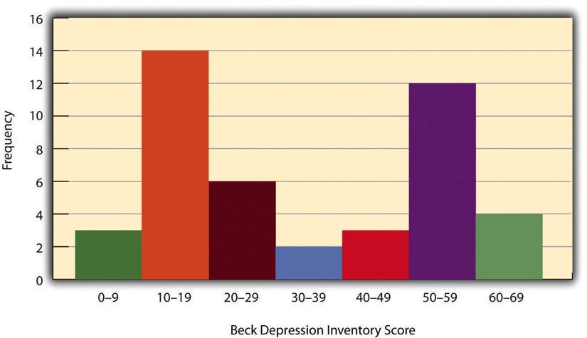
Sometimes, a distribution has two distinct peaks, which is called bimodal. This can happen if the data naturally clusters into two groups. For example, the histogram in Figure 10.1.2 shows hypothetical scores on the Beck Depression Inventory with two peaks: one for individuals with low depression scores and another for those with high depression scores. Although distributions can have more than two peaks (multimodal), such patterns are rare in psychological research.
Symmetrical vs. Skewed Distributions
In Figure 10.1.3, we see another important feature of a distribution’s shape is whether it is symmetrical or skewed:
- A symmetrical distribution has two sides that are mirror images of each other, with the peak in the centre.
- A negatively skewed distribution has a peak shifted toward the higher end of the range, with a long tail stretching toward the lower values.
- A positively skewed distribution has a peak shifted toward the lower end of the range, with a long tail stretching toward the higher values.
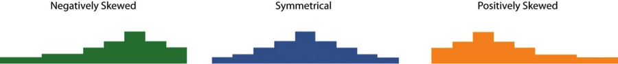
Skewness often indicates something meaningful about the data. For example, a negatively skewed distribution might suggest a test was too easy, while a positively skewed distribution could indicate a test was too difficult.
Outliers
An outlier is a data point that is much higher or lower than the rest of the scores in the dataset. Outliers can occur for several reasons:
- They may represent genuine extreme values. For example, one person in a sample might score extremely high on a depression inventory while the rest score low.
- They can also result from errors, such as incorrect data entry, misinterpretation by participants, or equipment malfunctions.
Outliers are important because they can distort statistical results and misrepresent trends in the data. Later in this chapter, we will discuss how to identify, interpret, and handle outliers effectively.
Chapter Attribution
Content adapted, with editorial changes, from:
Research methods in psychology, (4th ed.), (2019) by R. S. Jhangiani et al., Kwantlen Polytechnic University, is used under a CC BY-NC-SA licence.
