10.4. Describing Statistical Relationships
By Rajiv S. Jhangiani, I-Chant A. Chiang, Carrie Cuttler and Dana C. Leighton, adapted by Marc Chao and Muhamad Alif Bin Ibrahim
In psychological research, most questions focus on exploring the relationships between variables. These relationships help researchers understand patterns, make predictions, and test theories about behaviour, thoughts, and emotions.
Statistical relationships generally fall into two main categories:
- Differences between groups or conditions: These relationships compare two or more groups or experimental conditions to see if they differ in some measurable way. For example, a study might compare self-esteem scores between individuals who practice daily meditation and those who do not.
- Relationships between quantitative variables: These relationships examine how two numerical variables change together. For instance, a researcher might investigate whether higher levels of stress are linked to lower academic performance.
In this section, we will take a closer look at how to describe, interpret, and present these statistical relationships in a clear and meaningful way. Understanding these relationships allows researchers to draw conclusions and contribute valuable insights to the field of psychology.
Differences Between Groups or Conditions
When researchers compare groups or conditions in psychological studies, they often describe the results using two key statistical measures: the mean and the standard deviation for each group. These measures help summarise the average performance of each group and show how much individual scores vary around that average.
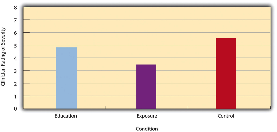
For example, Thomas Ollendick and his colleagues (2009) conducted a study to compare two treatments for children with simple phobias, such as an intense fear of dogs. The children were randomly assigned to one of three groups:
- Exposure Group: Children directly confronted their fears with the help of a trained therapist.
- Education Group: Children learned about phobias and coping strategies.
- Wait-List Control Group: Children received no treatment during the study but were promised treatment afterwards.
To measure the severity of the children’s phobias, a clinician (who did not know which treatment each child received) rated their fear on a scale from 1 to 8. The results showed:
- Exposure Group: Mean = 3.47, Standard Deviation = 1.77
- Education Group: Mean = 4.83, Standard Deviation = 1.52
- Control Group: Mean = 5.56, Standard Deviation = 1.21
These results indicate that both treatments helped reduce fear, but the exposure treatment was more effective than the education treatment. Differences like these are often illustrated using bar graphs, like the one shown in Figure 10.4.1, where each bar represents the mean score for a group.
Effect Size: Cohen’s d
In addition to reporting the mean and standard deviation, researchers often calculate the effect size to describe the strength of the difference between groups. The most common measure of effect size for group comparisons is Cohen’s d, calculated using this formula:
- M1 and M2 represent the means of the two groups.
- SD represents the standard deviation (often an average of the two groups’ standard deviations, known as the pooled standard deviation).
Cohen’s d tells us how much the two group means differ in terms of standard deviation units. For example:
- A Cohen’s d of 0.50 means the group means differ by half a standard deviation.
- A Cohen’s d of 1.20 means the group means differ by 1.2 standard deviations.
To interpret Cohen’s d values:
- 0.20 indicates a small effect size
- 0.50 indicates a medium effect size
- 0.80 or higher indicates a large effect size
In Ollendick’s study, the difference between the exposure and education treatments had a large effect size (d = 0.82), highlighting a significant difference in their effectiveness.
Cohen’s d is valuable because it provides a standardised measure of the difference between groups. Whether measuring self-esteem, reaction times, or blood pressure, a Cohen’s d of 0.20 always indicates a small effect, and a d of 0.80 always indicates a large effect. This standardisation allows researchers to:
- Compare results across different studies.
- Combine data from multiple studies in meta-analyses.
- Communicate findings more clearly.
Caution About the Term ‘Effect Size’
It is important to note that effect size does not automatically imply causation. For example:
- In an experiment where participants are randomly assigned to exercise or no-exercise groups, a Cohen’s d of 0.35 might suggest that exercise caused a slight increase in happiness.
- In a cross-sectional study, where researchers simply compare people who exercise with those who do not, the same effect size would only suggest an association, not a cause-and-effect relationship.
While effect size is a powerful tool for understanding group differences, it must be interpreted carefully within the context of the study design.
Correlations Between Quantitative Variables
In psychology, many research questions focus on understanding relationships between quantitative variables. These relationships, called correlations, help researchers identify patterns and trends in data.
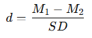
For example, researchers Kurt Carlson and Jacqueline Conard (2011) studied the link between the alphabetical order of people’s last names and their response speed to consumer offers. In their study, MBA students were emailed about free basketball tickets available in limited supply. The results in Figure 10.4.2 showed that students with last names closer to the end of the alphabet tended to respond more quickly.
These relationships are often shown visually using line graphs or scatterplots.
- Line Graphs: These are used when the x-axis represents a variable with a small number of distinct values, like the four quartiles of last names in Carlson and Conard’s study (as shown in Figure 10.4.2). Each point on the line graph shows the average response time for a group of students based on their alphabetical quartile.
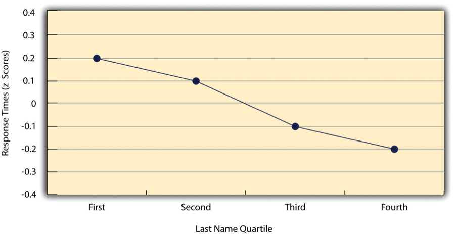
- Scatterplots: These are used when the x-axis represents a variable with many possible values, such as self-esteem scores. Each point represents an individual participant. For example, a scatterplot might show the relationship between students’ self-esteem scores on two different occasions (as shown in Figure 10.4.3).
Positive vs. Negative Relationships
Correlations can show positive or negative relationships:
- In a positive relationship, higher scores on one variable are associated with higher scores on another. On a scatterplot, the points tend to trend upward from bottom-left to top-right.
- In a negative relationship, higher scores on one variable are associated with lower scores on another. The points trend downward from top-left to bottom-right.
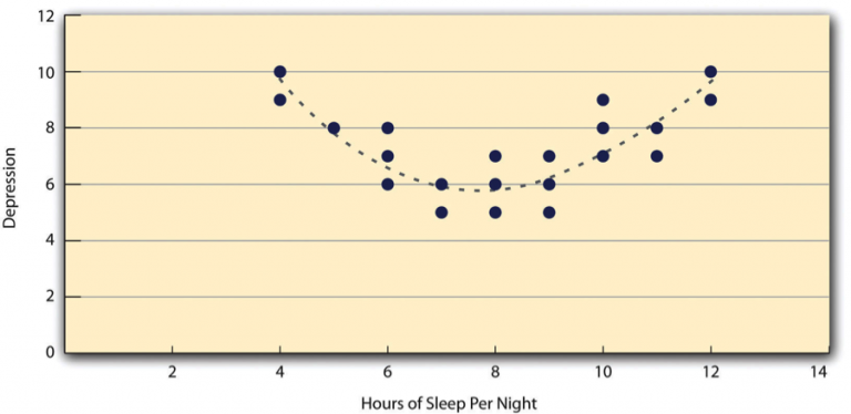
Both of these relationships are considered linear relationships because they can be represented by a straight line on a scatterplot. Sometimes, however, relationships are nonlinear, meaning the data points follow a curved pattern instead.
For example, the relationship between sleep duration and depression levels might form an upside-down U-shaped curve. People who sleep around eight hours may have lower depression levels, while those who sleep too little or too much might have higher levels of depression. In such cases, a straight line cannot accurately represent the data (as shown in Figure 10.4.4).
Measuring the Strength of Correlations: Pearson’s r
As discussed in Chapter 6, to quantify the strength and direction of a correlation, researchers use Pearson’s r, a statistical measure that ranges from -1.00 to +1.00:
- +1.00 represents a perfect positive relationship.
- -1.00 represents a perfect negative relationship.
- 0.00 means no relationship exists between the two variables.
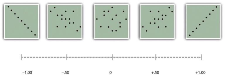
According to Cohen’s guidelines, as illustrated in Figure 10.4.5:
- ±0.10 indicates a small correlation.
- ±0.30 indicates a medium correlation.
- ±0.50 indicates a large correlation.
It is important to remember that the sign (+ or -) indicates the direction of the relationship, not its strength. For example, +0.30 and -0.30 are equally strong, but one shows a positive trend and the other a negative trend.
How Pearson’s r is Calculated
While software usually handles these calculations, understanding the process helps clarify what Pearson’s r represents. It is essentially the average of the cross-products of z-scores for two variables:
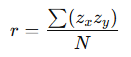
- Convert each score into a z-score by subtracting the mean and dividing by the standard deviation for that variable.
- Multiply each pair of z-scores (one from each variable).
- Find the average of these cross-products.
This calculation results in a value between -1.00 and +1.00, summarising the strength and direction of the relationship.
When Pearson’s r Can Be Misleading
- Nonlinear Relationships: Pearson’s r assumes a linear relationship. If the data follows a curve (like the sleep-depression example), Pearson’s r might inaccurately suggest no relationship. Always check your scatterplot to ensure the relationship is roughly linear before relying on Pearson’s r.
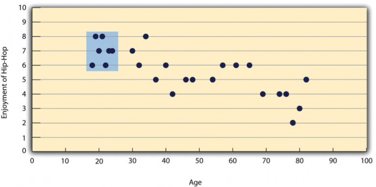
- Restriction of Range: Pearson’s r can also be misleading if the range of one or both variables is limited. For example in Figure 10.4.6:
- A study might show a strong negative correlation between age and enjoyment of hip-hop music across all age groups.
- However, if the sample includes only 18- to 24-year-olds, the correlation might appear weak or non-existent because the variability in age is too limited.
- To avoid this issue, researchers should aim to collect data from a wide range of values for each variable. If restriction of range occurs, Pearson’s r should be interpreted cautiously.
References
Carlson, K. A., & Conard, J. M. (2011). The last name effect: How last name influences acquisition timing. The Journal of Consumer Research, 38(2), 300–307. https://doi.org/10.1086/658470
Ollendick, T. H., Öst, L.-G., Reuterskiöld, L., Costa, N., Cederlund, R., Sirbu, C., Davis, T. E. III, & Jarrett, M. A. (2009). One-session treatment of specific phobias in youth: A randomized clinical trial in the United States and Sweden. Journal of Consulting and Clinical Psychology, 77(3), 504–516. https://doi.org/10.1037/a0015158
Chapter Attribution
Content adapted, with editorial changes, from:
Research methods in psychology, (4th ed.), (2019) by R. S. Jhangiani et al., Kwantlen Polytechnic University, is used under a CC BY-NC-SA licence.
