Module 9. Quality control
The quality control process involves inspecting, testing and reporting the project outputs. The purpose is to ensure that the project outcomes meet the quality requirements outlined at the start of the project. Quality control is achieved by ensuring conformance, decision-making steps and process improvements (which are outlined in the quality assurance process) (Juran and Godfrey 1998; Grosfeld-Nir et al. 2006; Rever 2007; Kerzner 2009; PMI 2021). Quality control identifies that outputs provided are at the expected level. It is outlined within the quality management plan and documentation which ensures that the project team understands the project control process.
In the quality planning phase, metrics are determined and these are used to analyse quality outcomes (PMI 2021). A key component of process quality control involves monitoring quality within the project. Juran’s Quality Trilogy and Six Sigma are both methods which can be used to implement quality controls within project management. These are outlined below.
Juran’s Quality Trilogy
Juran’s Quality Trilogy involves the implementation of 3 processes (Juran and Godfrey 1998):
- Quality planning. Start the process by planning activities which need to be completed to ensure the quality outcomes of a project or process (Juran and Godfrey 1998). Quality planning consists of understanding the client, determining requirements, defining features, designing outcomes or deliverables, and outlining a process which can ensure quality.
- Quality control. This is how the project team will adhere to the processes outlined in planning (Juran and Godfrey 1998). This requires process assurance, measuring metrics and ensuring the process is meeting requirements. Where issues arise and corrective or preventive actions are taken, root cause analysis needs to be conducted. Deviations in metrics should be monitored and updated to meet required targets.
- Quality improvement. Improvements require a process that takes into consideration changes in the environment, the needs of clients and market demands (Juran and Godfrey 1998). Quality improvement should be used to identify and implement improvement opportunities, based on existing performance.
Juran’s Quality Trilogy is commonly associated with quality control processes, as the 3 steps are linked to one another. Therefore, to appropriately implement quality control processes, each component needs to be implemented and streamlined to create an end-to-end quality management plan.
Six Sigma
The Six Sigma process in quality management involves embedding continuous improvement into the organisation and projects. Six Sigma aims for the project to have consistent and predictable outputs (Tennant 2001; De Fao and Barnard 2005). To successfully implement the quality management process, there needs to be top-down endorsement and support. The process focuses on measurable outcomes, leadership, and a commitment to make data-informed decisions throughout the project.
Quality within the Six Sigma method focuses on consistency, reducing issues and the predictability of the outputs. Within statistics, Six Sigma is 6 times the sigma (standard deviation) from the mean (Tennant 2001; De Fao and Barnard 2005). Therefore, the data point needs to be up to 6 standard deviations from the mean. This allows for 99.99966% of deliverables to be free from issues and equates to 3.4 defects per million.
Within Six Sigma, there is a primary methodology used to understand quality control. According to Deming et al. (2012), DMAIC can be used to improve a project’s outcomes or create a quality control process. This is outlined in Figure 23.
Figure 23. DMAIC project quality control 5-phase process, by Carmen Reaiche, Samantha Papavasiliou and Frank Anglani, licensed under CC BY (Attribution) 4.0
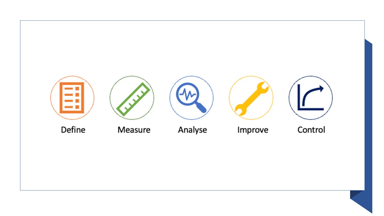
The 5 phases within DMAIC are:
- Define: define the problem space, project, outcomes or system, based on the requirements set by the clients or stakeholders which meet the project goals or outcomes.
- Measure: data needs to be collected on the current process, to ensure that there is a baseline, and continue to be collected throughout the project.
- Analyse: data needs to be analysed in order to understand causation and relationships between all factors. This helps identify the root causes of a problem or issue.
- Improve: the optimisation of the current process is based on data analysis, in order to create new future processes.
- Control: future processes ensure deviations are responded to and do not lead to problems. This process should be ongoing to ensure the quality level is maintained.
The DMAIC improvement process is a key part of the Six Sigma process. However, it is not only used within Six Sigma and is often used as a framework to support the improvement of quality within projects, systems and products. Six Sigma can be used to support quality control using many tools and techniques.
Tools and techniques
Within both Juran’s Quality Trilogy and Six Sigma methods there are 7 key tools and techniques which are used in quality control processes (Ishikawa 1985). These are outlined below.
Root cause analysis
The root cause analysis process has been outlined in previous modules. Root cause analysis supports both quality assurance and control processes in projects, product development and improvements to business processes. Using the Ishikawa diagram helps us understand the potential causes of a problem statement and the relationships between them.
Stratification
The stratification technique is used to separate data from various sources, to identify patterns. This analysis supports quality control tools, which sorts data, objects and resources into separate categories and distinct groups (Juran and Godfrey 1998; Grosfeld-Nir et al. 2006; Rever 2007; Kerzner 2009; PMI 2021). The stratification processes help us to identify meaning, patterns and themes within the data which may not have otherwise been visible. There are 3 primary steps involved in the stratification process:
- Prior to data collection, there needs to be consideration of how different types of data will be documented and understood. By establishing a process for data collection early on, it will support the analysis process and consistency of data.
- Different data sources or types need to be plotted within a scatter plot, control chart or histogram, using different colours. This shows that the data has been stratified.
- Data analysis needs to be completed separately for each set of stratified data.
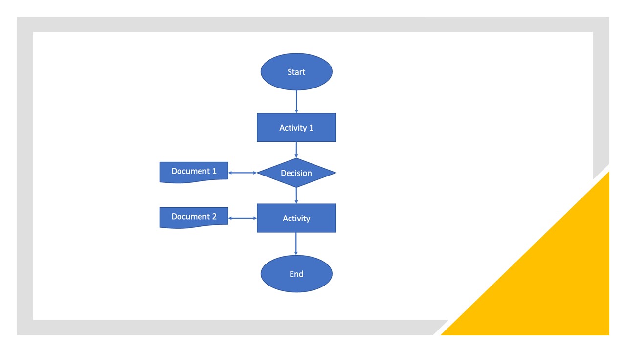
In some circumstances, project teams will use a flowchart instead of following the stratification process, to break up the project into smaller and more manageable chunks. The flowchart shows a process or a project. It visualises the events or activities completed in their order or parallel to one another (PMI 2021). An example is shown in Figure 24.
Figure 24. Example of a project flowchart, by Carmen Reaiche, Samantha Papavasiliou and Frank Anglani, licensed under CC BY (Attribution) 4.0
Check sheets
A check sheet is a structured document, which is used to collect and analyse quality data (PMI 2021; Rever 2007). Check sheets are generic forms; however, they can be tailored to meet the requirements of the project, the manager and the team. An example is provided in Figure 25.
Figure 25. Example of a check sheet, by Carmen Reaiche, Samantha Papavasiliou and Frank Anglani, licensed under CC BY (Attribution) 4.0
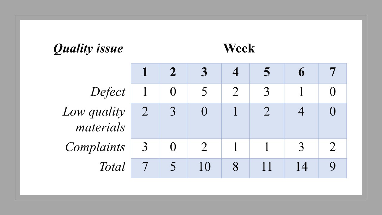
There are 6 key steps involved in creating a check sheet:
- Document the problem statement.
- Determine what data collection is required, and the period during which it will be measured.
- Design the check sheet, and ensure the process is easy to follow.
- Clearly label the form.
- Trial the check sheet over a period of time and ensure that the data is appropriately collected and easy to follow.
- As an event occurs, record it.
A check sheet is used to simply tally the occurrence of events and supports the application of the continuous improvement process (as outlined in our previous modules).
Control charts
Control charts are used to document if a project’s quality performance meets expectations. These charts graphically display how the project quality changes over time by comparing the current data to historical control data limits (Rever 2007; PMI 2021). This allows project managers and team members to understand the variations in the quality. There are 5 steps to creating a control chart:
- Choose appropriate levels of upper and lower control limits. These are commonly 3 standard deviations from the mean or the control limit (CL).
- Determine the time period for data collection and analysis.
- Collect and analyse the data.
- Determine if there are signals that the quality is deviating out of control (e.g., the data shows deviations above the upper control limit (UCL) or below the lower control limit (LCL)). Project managers and team members should look for patterns across the timeframe of data collected.
- Data should be plotted as generated and out of control checks should be conducted.
To calculate the CL:
- CL is the average. This is often calculated by determining the average across 10 to 20 points in the timeframe under review.
- UCL is the longest or largest deviation that would be accepted within the quality controls. This is often between 1 and 6 standard deviations above the average.
- LCL is the smallest deviation that would be accepted within the quality controls. This is often between 1 and 6 standard deviations below the average.
Figure 26. Example of a control chart, by Carmen Reaiche, Samantha Papavasiliou and Frank Anglani, licensed under CC BY (Attribution) 4.0
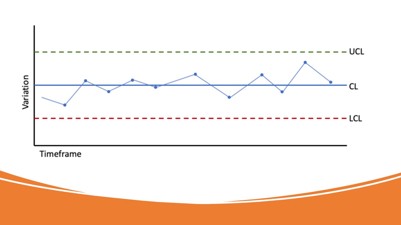
An example of a control chart is outlined in Figure 26. The control chart outlines how the quality within the project changes over time and defines the acceptable variation limits. Control charts can be used to understand the deviations in quality across a project, an organisation or a product life cycle.
Histogram
A histogram shows the frequency distribution. The graph visually displays how often each value occurs within the dataset. A histogram shows the shape of numerical data distributions, which is used to determine if the output is normally distributed (Rever 2007; PMI 2021). An example of a histogram is outlined in Figure 27.
Figure 27. Example of a histogram with a normal distribution, by Carmen Reaiche, Samantha Papavasiliou and Frank Anglani, licensed under CC BY (Attribution) 4.0
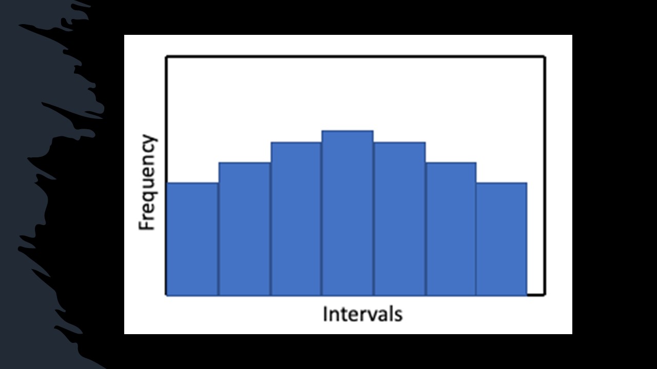
There are 7 common steps involved in creating histograms:
- Collect a minimum of 50 data points. The data needs to be consecutive data points.
- Divide the numbers over the range of data into intervals of equal length.
- Count the number of data points within each interval.
- The vertical axis outlines frequencies.
- The horizontal axis outlines the lower value of each interval and labels the axis of the type of data displayed.
- Draw the bars extending from the lower value for each interval to lower values up the next interval.
- Each bar’s height needs to be equal to the frequency of the corresponding interval.
Common types of distributions:
- Normal distribution: also referred to as the bell-curve, which is the typical distribution. This distribution shows that points on either side of the average are likely to be similar.
- Skewed distribution: this distribution is asymmetrical – there is a peak on one side of the average.
- Bimodal distribution: this distribution has 2 peaks and shows 2 distributions across one set of data.
A histogram can be used to outline frequency distribution for continuous variables. The histogram shows numerical data and outlines how quality is tracking across the project, showing where poor performance is occurring and improvements are required.
Pareto chart
A Pareto chart is a type of bar graph, where the length of each bar outlines the frequency of cost, time, or resources. The bars within the Pareto chart are arranged left to right, with the longest bars on the left and short to the right. The chart is used to visualise the situations or factors which are significant. This chart can be used to understand causes.
The Pareto chart follows the 80/20 Pareto Principle. This principle states that most issues are derived from a common cause and there are often only a few contributors. Within this principle, 80% of issues come from 20% of causes (Grosfeld-Nir et al. 2006). These causes are often shown in the Pareto chart. An example is presented in Figure 28.
Pareto charts analyse data to understand the problem frequencies within a project. Significant issues can be identified by the frequency of their occurrence on the chart. These are easy to share with stakeholders as they visualise the problems.
Figure 28. Example of a Pareto chart, by Carmen Reaiche, Samantha Papavasiliou and Frank Anglani, licensed under CC BY (Attribution) 4.0
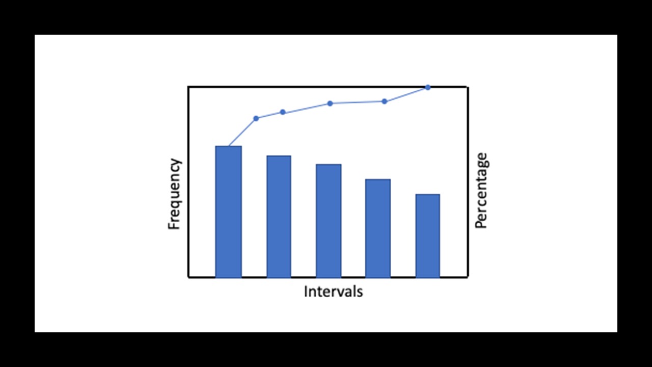
There are 9 steps to creating Pareto charts:
- Decide on the categories along the intervals.
- Decide appropriate measures – the most common is frequency.
- Outline the time period under review.
- Collect and record data based on categories.
- Sum the measures for each category.
- Consider an appropriate measurement scale (e.g., maximum value from step 5).
- Outline the axes, add the largest bar on the left and continue until the smallest bar is on the right.
- Calculate percentages for each category. The value of each category should be divided by the total for each category and be documented as percentages along the vertical axis on the right side. The scales across the right and left axes should be the same.
- This is an optional step, where the project team can add labels above each bar within the chart to show scale.
The Pareto chart can be used to help the project team identify the most frequent causes of quality issues within the project. It helps the project team to communicate their rationale for making decisions.
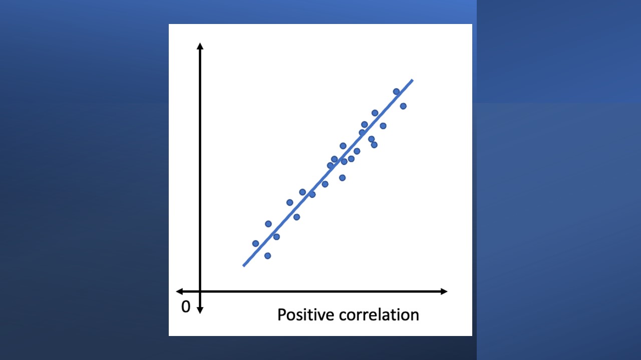
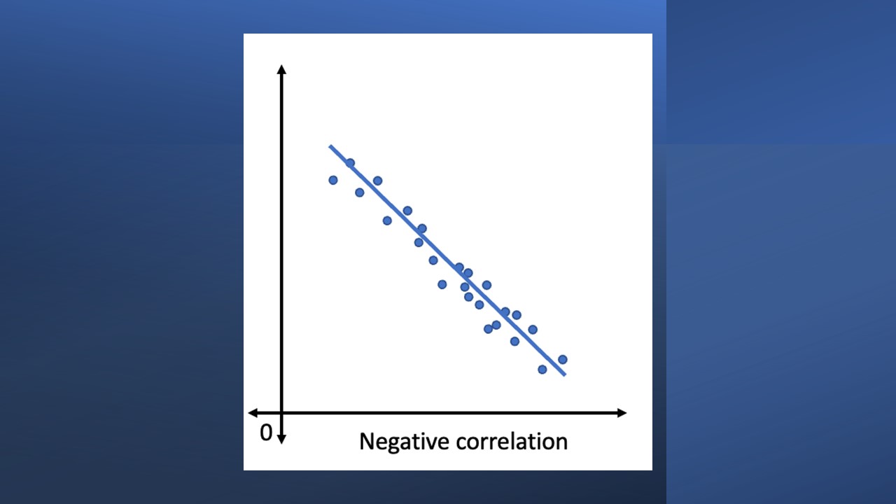
Scatter diagram
Scatter diagrams are the graphical representation of 2 numerical variables. Within quality control processes, it helps identify links between the project elements on one axis and the quality issues on the other (Rever 2007; Kerzner 2009; PMI 2021). A scatter diagram shows the relationships between changing a dependent variable and a corresponding independent variable. The role of the independent variable is to explain the observed outcome. Within the diagram, the points should fall along a ‘line’ when a correlation between variables is observable. These diagrams are useful when attempting to forecast the behaviours of a dependent variable based on the independent variables, once the relationship has been established.
Types of Scatter diagrams
- Positive correlation: where there is a positive correlation between variables, when the independent variable’s value increases so does the dependent variable’s. An example is provided in Figure 29.
Figure 29. Scatter diagram example with positive correlation, by Carmen Reaiche, Samantha Papavasiliou and Frank Anglani, licensed under CC BY (Attribution) 4.0
2. Negative correlation: where a negative correlation exists, when the variable’s value increases, the other variable’s value decreases. As the independent variable shows a value decrease, the dependent variable’s value decreases. An example is shown in Figure 30.
Figure 30. Scatter diagram example with negative correlation, by Carmen Reaiche, Samantha Papavasiliou and Frank Anglani, licensed under CC BY (Attribution) 4.0
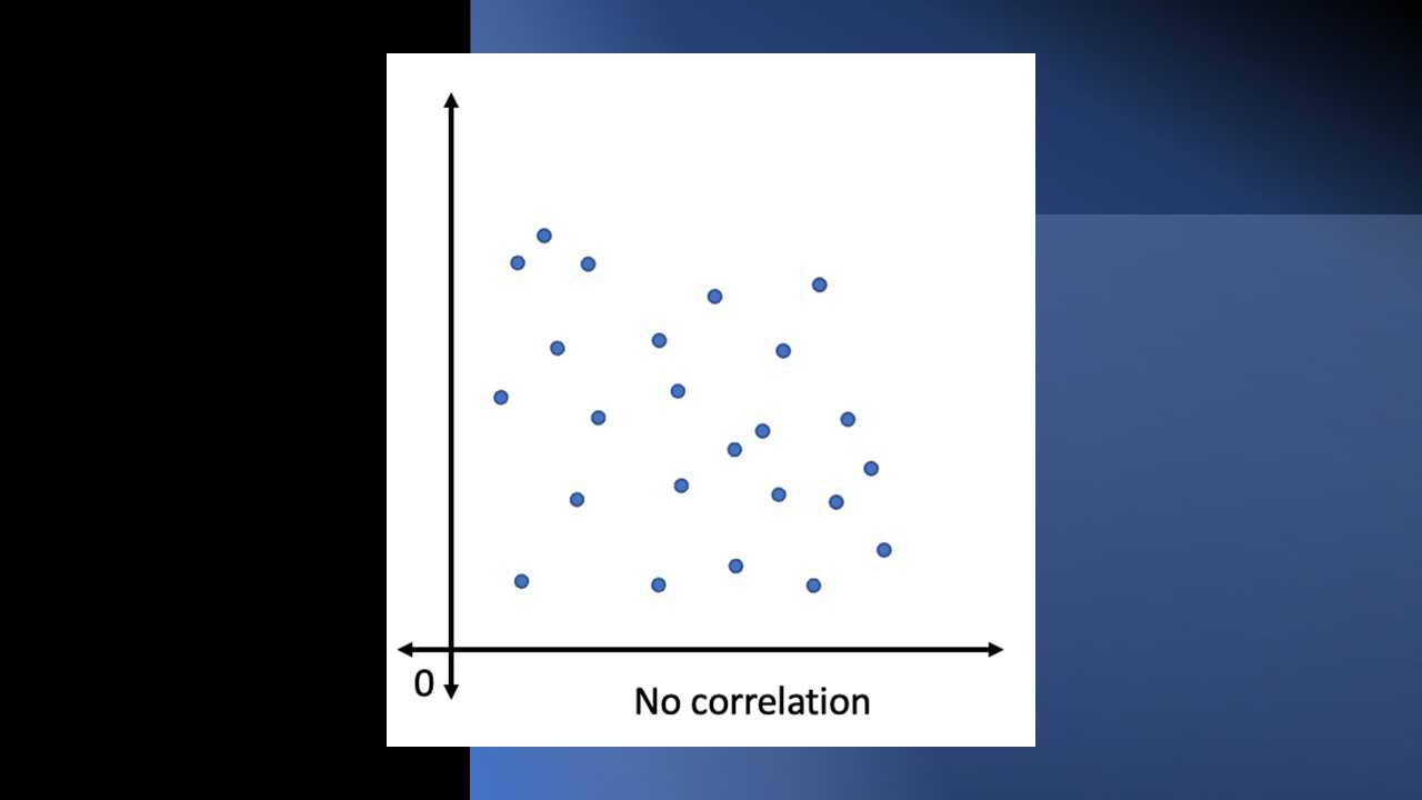
3. No correlation: there is no link between the dependent and independent variables. An example is shown in Figure 31.
Figure 31. Scatter diagram example with no correlation, by Carmen Reaiche, Samantha Papavasiliou and Frank Anglani, licensed under CC BY (Attribution) 4.0
There are 5 key steps in creating a scatter diagram:
- Dependent and independent variable identification: determine which variable is the independent variable (or the cause). In contrast, determine which is the dependent variable that is affected by the changes of the independent variable.
- Collect data on both variables.
- Develop the scatter diagram/plot: use a tool (e.g., Microsoft Excel) to create the scatter plot by connecting dots which represent specific numerical data points.
- Outline the correlation type: plot the dots and determine the correlation between the 2 variables. Within a scatter plot, the line can be upward (showing a positive relationship), downward (showing a negative relationship) or undefined (where no relationship is identified).
- Draw conclusions based on the scatter plot: determine the key issues and fix the problems identified.
The scatter diagram is used to control and monitor project quality by highlighting issues and problems associated with quality. The scatter diagram should be used to determine the relationships between issues or problems identified within the Ishikawa diagram.
The following case study showcases the importance of quality cost management.
Case study
Quality costs (in many ways!)
By Shaun Kelly
Introduction
Professional services firms operate in a space where their clients engage them to provide an output that is usually only information. Professional services firms include lawyers, accountants, surveyors and similar disciplines. The information that they output may be advice on what the client needs to do or should not do. The information that the client seeks may be to solve a problem because the client has already done something that they perhaps should not have or not done something that they should have done.
Any business, not least a professional services firm, must have governance around the services that they provide. Governance is the ‘guard rails’ around how a business operates, including their outputs, and responds to laws, regulations and fulfilling the service promised to the client, often written into a legal contract.
Work From Home
Work From Home (WFH) has truly entered the everyday language in most countries, from the changing work arrangements resulting from the COVID-19 pandemic. Before 2020 though, at least since the early years of this century, professional services firms have been subject to ever-increasing client pressure to drive their fees down. Put simply, clients want them to be cheaper but do the same work, or even offer enhanced service. Sometimes the enhanced service or doing more work for the same or lower fees has been created by responding to greater regulation on all business. Quality must include providing a service that does not create a civil or criminal liability for the client or their firm – that requires greater governance.
This has partly led to an appreciation that where the service includes visits to the premises of the client or other designated premises, it may be more efficient in terms of travel distance, time and cost for the firm’s employee to work from home rather than travel each day to an office location, often in a Central Business District, and then travel from there to a visit location and back to the office. It will not have escaped the attention of firm management that less people based in an office usually means a smaller office footprint and so less office lease cost and associated expenses, for example, utilities.
WFH = Quality deficit
Professional service firms will employ trainees, often graduates, who are subject to supervision and mentoring by more experienced and usually postgraduate educated, professionally qualified managers or colleagues. The flight-plan for those trainees is that they become ever increasingly competent in what they do and hopefully themselves gain professional qualifications.
Firms should want to ‘grow their own and keep them’; that is, recruit staff, make them great at their job and sufficiently reward them that so that they do not leave to work elsewhere. Before WFH, a trainee would have their manager or mentor sitting in close proximity to their own workspace. That would have meant that each new assignment and anything the trainee was unfamiliar with would have involved a face-to-face discussion in the office. Anything new to the trainee that arose as they were working through an assignment, perhaps from an email or telephone call, could be raised with the manager very easily. The trainee would usually be able to look up from their desk and see if their manager was busy or free for the trainee to wander over and ask them for a few minutes to discuss something. With WFH, the trainee may experience the frustration of telephoning the manager and getting no answer or a busy tone. In the advent of MS Teams or Zoom, the trainee will often see that the manager is ‘red’/busy when indeed they may just have blocked out time in their calendar to do some work but would otherwise have been available for their trainee if they were both in the office.
Another dynamic of remote working is poor knowledge and use of technology. Examples of managers remotely reviewing a trainee’s written output in, say, MS Word over email with neither person knowing of or using the Track Changes and Comments functionality are common. So, the manager may make amendments to the document that are not easily discernible and make margin comments that the trainee does not flag – both missing the function of tutoring the trainee.
Mistakes happen
WFH costs a business less in lease costs, utilities and travel from office to visit locations. However, the compromised face-to-face time, mentoring and supervision will inevitably translate to less than firm guard-rails and will likely negatively impact governance and the quality of the trainee. It can be unavoidable that mistakes happen.
Those mistakes can mean that a client suffers some financial or reputational harm and seeks compensation from the firm (i.e., they make demand for monetary compensation). The firm may be able to defend the claim but some annoyance may remain with the client, or the firm may accept the mistake and so suffers financial harm themselves. The client’s confidence in the firm may suffer regardless and that reputational harm could cause the loss of the client’s business entirely.
Quality is not just important to a firm and its client. I believe that fundamentally no one engages in work activity to do a bad job. Employees instinctively want to do a great job. They want to create quality. People want to grow in their role(s). They want to receive praise and progress to more interesting, personally fulfilling and hopefully more financially rewarding tasks, responsibilities and roles. A career, though, is more than just money.
They can best do that with effective supervision and mentoring. Technology is, of course, an enabler when people are trained on its function. Microsoft 365 and similar other office applications and technologies can enable learning and quality growth for a trainee. There must always be physical meetings occasionally, certainly to discuss work product, but also socially to build a comfortable working relationship between the trainee, supervisor and mentor. Empathy is best established in the context of a physical meeting.
Now let’s revise our knowledge:
Key Takeaways
- Project quality control processes include 7 common tools and techniques.
- Project quality control is strongly linked to the quality assurance and continuous improvement process within the project.
- They are used to support project managers to understand where issues sit, how they can be communicated, to visually display the current state, and support informed decision-making.
- The implementation of quality control processes support project managers and team members to provide the highest quality outcomes.
- Quality control requires monitoring quality throughout each project phase, to ensure that quality standards are met and adjustments can be made to get them back on track.
References
De Fao JA and Barnard W (2005) Juran Insitute’s Six Sigma breakthrough and beyond – quality performance breakthrough methods, McGraw Hill, New York.
Deming EW, Orsini J and Cahill DD (2012) The essential Demining: leadership principles from the father of quality, McGraw Hill, New York.
Grosfeld-Nir A, Ronen B and Kozolvsky N (2006) ‘The Pareto Managerial Principle: when does it apply?’ International Journal of Production Research, 45(10):2317–2325.
Ishikawa K (1985) What is Total Quality Control? The Japanese way (Lu DJ trans), Prentice-Hall, Englewood Cliffs, New Jersey.
Juran M and Godfrey A (1998) Juran’s Quality handbook, 5th edn, McGraw-Hill Companies, Inc., Washington.
Kerzner H (2009) Project management: a systems approach to planning, scheduling, and controlling, 10th edn, John Wiley and Sons, Inc., Hoboken, New Jersey.
Project Management Institute (2021) A Guide to the Project Management Body of Knowledge (PMBOK® Guide), 7th edn, Project Management Institute, Newtown Square, PA.
Rever H (2007) ‘Quality in project management: a practical look at chapter 8 of the PMBOK® guide’, paper presented at PMI® Global Congress 2007—Latin America, Cancún, Mexico, Project Management Institute, Newtown Square, PA.
Tennant G (2001) Six Sigma: SPC and TQM in manufacturing and services, Gower Publishing, Ltd., United Kingdom.
